With contrast comes beauty
Along Little Bourke Street in the heart of Melbourne, Acne Studios has reopened its doors to the world after extensive renovations. Now double the size of the original store with over 215 square metres, it is a feast for the eyes and soul.
Understanding Acne Studios’ design comes from understanding the brand’s ethos. With a mix of its DNA and Swedish roots, the Acne ethos comes from reflecting each of the store’s surroundings. And for Melbourne, contrast is key.
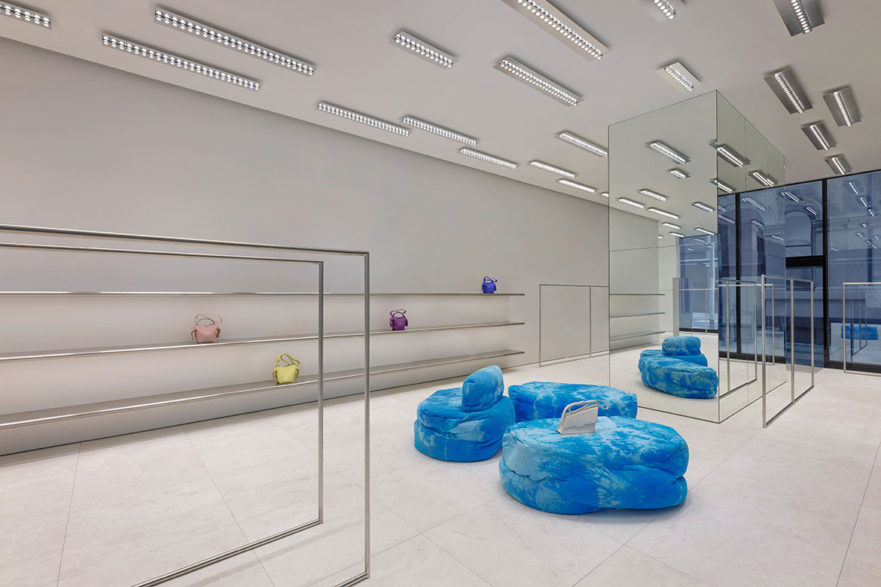
The interiors utilise minimalist design cues with a smattering of bold colour, brought to life by Max Lamb. The walls and ceiling are made of white high-gloss stucco lustre that spread across the store. It crafts subtle contrasts to the ground, with light grey marble floors that have an elegant, textural sand-blasted finish.
The floor plan reaches out with open spaces, allowing oneself to be drawn to even the slightest design. And who wouldn’t? The long layout of the space encourages movement throughout, not only to explore products but to feel a sense of spaciousness.
Max Lamb takes the design ethos of Acne Studios and makes it his own. The colour palette is muted and soft, contrasting perfectly with the furniture. Also designed by Max Lamb, the dyed blue canvas furniture with a batik pattern tells an expressive and impactful narrative against the interior’s simple palette.
The choice of palette, materiality and landscape, while individually conflicting against one another, are embraced with the lighting design by Benoit Lalloz. Illuminating the store’s landscape through the light installations is a crucial feature, as it celebrates the interior in subtle yet bold ways. “My job is to allow customers to have the best possible visual experience in order to read and discover the works,” Lalloz says.
A striking highlight of the store is a mirrored cube home to the service counter. As an embodiment of the store’s sleek design, the monolithic structure reflects and multiplies Lalloz’s light installations. It is also another juxtaposition for the store, with its sharp lines working with the organic shapes of the furniture.
Melbourne itself is a city of contrasts through architecture, design and ideas, and Acne Studios’ new renovations are an ode to that. Its ethos comes to full flight with this store’s design, making this shopping experience one of bold serenity.
Project details
Interiors – Max Lamb
Lighting Design – Benoit Lalloz
Photography – Courtesy of Acne Studios
We think you might like this story about a new type of retail concept that awakens the senses – The Raconteur
The post With contrast comes beauty appeared first on Habitusliving.com.
Along Little Bourke Street in the heart of Melbourne, Acne Studios has reopened its doors to the world after extensive renovations. Now double the size of the original store with over 215 square metres, it is a feast for the eyes and soul.
Understanding Acne Studios’ design comes from understanding the brand’s ethos. With a mix of its DNA and Swedish roots, the Acne ethos comes from reflecting each of the store’s surroundings. And for Melbourne, contrast is key.
The interiors utilise minimalist design cues with a smattering of bold colour, brought to life by Max Lamb. The walls and ceiling are made of white high-gloss stucco lustre that spread across the store. It crafts subtle contrasts to the ground, with light grey marble floors that have an elegant, textural sand-blasted finish.
The floor plan reaches out with open spaces, allowing oneself to be drawn to even the slightest design. And who wouldn’t? The long layout of the space encourages movement throughout, not only to explore products but to feel a sense of spaciousness.
Max Lamb takes the design ethos of Acne Studios and makes it his own. The colour palette is muted and soft, contrasting perfectly with the furniture. Also designed by Max Lamb, the dyed blue canvas furniture with a batik pattern tells an expressive and impactful narrative against the interior’s simple palette.
The choice of palette, materiality and landscape, while individually conflicting against one another, are embraced with the lighting design by Benoit Lalloz. Illuminating the store’s landscape through the light installations is a crucial feature, as it celebrates the interior in subtle yet bold ways. “My job is to allow customers to have the best possible visual experience in order to read and discover the works,” Lalloz says.
A striking highlight of the store is a mirrored cube home to the service counter. As an embodiment of the store’s sleek design, the monolithic structure reflects and multiplies Lalloz’s light installations. It is also another juxtaposition for the store, with its sharp lines working with the organic shapes of the furniture.
Melbourne itself is a city of contrasts through architecture, design and ideas, and Acne Studios’ new renovations are an ode to that. Its ethos comes to full flight with this store’s design, making this shopping experience one of bold serenity.
Project details
Interiors – Max Lamb
Lighting Design – Benoit Lalloz
Photography – Courtesy of Acne Studios
We think you might like this story about a new type of retail concept that awakens the senses – The Raconteur
The post With contrast comes beauty appeared first on Habitusliving.com.